SMARTPARK

SMARTPARK

SMARTPARK

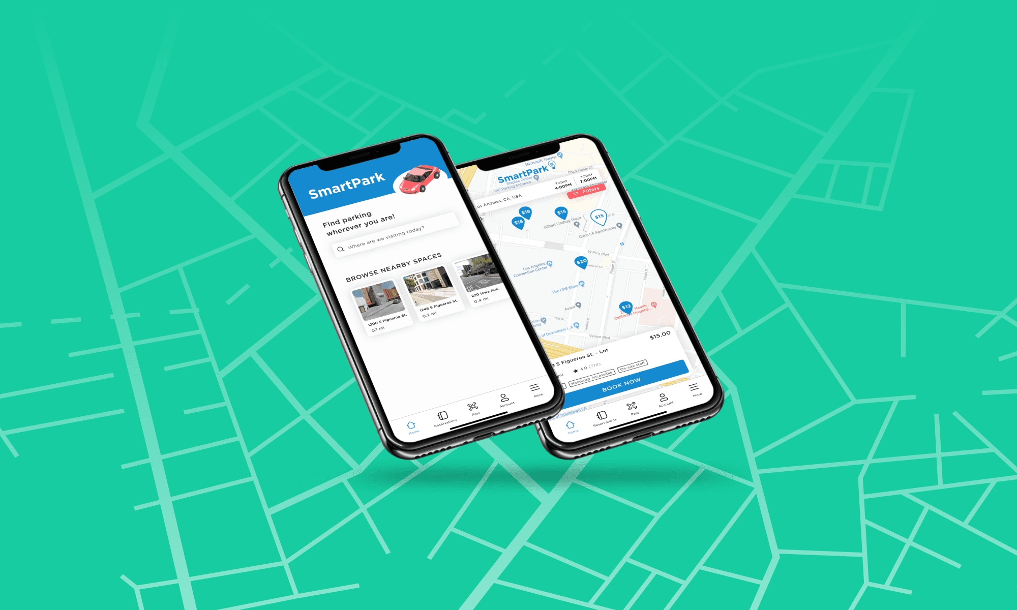
Designed an end-to-end mobile application for a smarter and faster solution to finding parking in the city.

ROLE
UX Designer

TIME
2 weeks

DELIVERABLES
End-to-End Mobile App

ABOUT SMARTPARK


Visiting a metropolitan city can be fun and exciting. With many opportunities to explore, the last thing you want to worry about is finding parking in the city. SmartPark is a mobile app that tackles these issues that drivers face by allowing users to find parking spaces as well as reserve spaces in advance.

MY CONTRIBUTION


As part of my UX Academy program, I was tasked with designing an end-to-end mobile application. I decided to focus on an issue that I encounter frequently, which is finding parking in metropolitan cities.


Note: Although this capstone project will most likely not be developed, the research and data gathered are organic and are based on real users' voices.

Our high-level goals were to:


  • Design a mobile app for SmartPark that allows users to explore parking options in cities

  • Create a branding guide for SmartPark

DESIGN PROCESS


For this project, I followed the Design Thinking process to find the best solutions for end-users
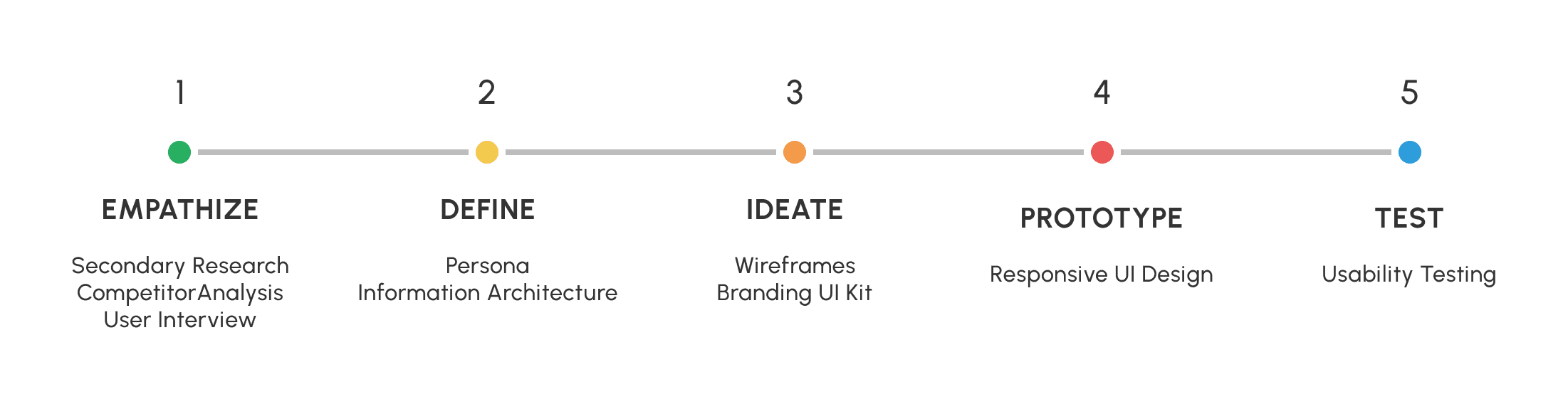
01

01

Empathize

SECONDARY RESEARCH


To guide my research, I first began by outlining clear goals:


  • Understand the target audience and how SmartPark can assist them

  • Explore opportunities that may improve the user experience of the app

  • Evaluate pain points from direct competitors and how they can be addressed on SmartPark


Given the 2 weeks constraint that I was working with, I decided to focus on efforts using three different methodologies for research: secondary research, competitor analysis, and user interviews.

On average, drivers spend roughly 17 hours each year looking for parking. This equates to an estimated $345 per driver in wasted time, fuel, and emissions.

On average, drivers spend roughly 17 hours each year looking for parking. This equates to an estimated $345 per driver in wasted time, fuel, and emissions.

While conducting secondary research, I came across informative data that supports SmartPark’s vision and purpose. Nearly 2/3 of U.S. drivers reportedly feel stressed when trying to find a parking spot. This suggests that having a seamless reservation process is a must for this project.


In addition, a survey conducted with nearly 6,000 participants shows that:

28%

28%

28%

of drivers mentioned that they avoided driving to shopping sites, airports, and sport centers due to parking

36%

36%

36%

of drivers have missed appointments because of parking issues

14%

14%

14%

of drivers abandoned a trip because of parking concerns

21%

21%

21%

of drivers experience frustration due to parking

COMPETITOR ANALYSIS


For my competitor analysis, I examined 3 companies that share similar visions to SmartPark. Here are the key takeaways:

  • Having a free flow interactive map is a must for drivers to explore their options

  • Include reviews for each parking location so that it builds user confidence when reserving a space

  • Provide users with filters to help narrow their search

STRENGTHS

  • Interactive map for users to navigate through

  • Lots of filter selections to help narrow down options

  • ParkMobile Pro gives you real-time data

  • QR scan feature embedded in app

STRENGTHS

  • Interactive map for users to navigate through

  • Lots of filter selections to help narrow down options

  • ParkMobile Pro gives you real-time data

  • QR scan feature embedded in app

STRENGTHS

  • Interactive map for users to navigate through

  • Lots of filter selections to help narrow down options

  • ParkMobile Pro gives you real-time data

  • QR scan feature embedded in app

WEAKNESSES

  • The reservation tab is a bit confusing with an inefficient flow

  • Not many parking selections in suburban cities

  • Must know zone number to use Park tab

  • Signing up is a bit of a hassle, asked for a lot of information before being able to explore parking spaces

WEAKNESSES

  • The reservation tab is a bit confusing with an inefficient flow

  • Not many parking selections in suburban cities

  • Must know zone number to use Park tab

  • Signing up is a bit of a hassle, asked for a lot of information before being able to explore parking spaces

WEAKNESSES

  • The reservation tab is a bit confusing with an inefficient flow

  • Not many parking selections in suburban cities

  • Must know zone number to use Park tab

  • Signing up is a bit of a hassle, asked for a lot of information before being able to explore parking spaces

STRENGTHS

  • Navigation is easy on the app, structure is clear

  • Clear filter options for users to use

  • Integrate both list view and map view for users to choose from

  • Allow users to favorite previous spaces

STRENGTHS

  • Navigation is easy on the app, structure is clear

  • Clear filter options for users to use

  • Integrate both list view and map view for users to choose from

  • Allow users to favorite previous spaces

STRENGTHS

  • Navigation is easy on the app, structure is clear

  • Clear filter options for users to use

  • Integrate both list view and map view for users to choose from

  • Allow users to favorite previous spaces

WEAKNESSES

  • No interactive map right off the bat, must enter information first

  • Customers tend to be frustrated with the double-transaction process; paying on the app and in person

  • Poor customer service/technical issues on the app

WEAKNESSES

  • No interactive map right off the bat, must enter information first

  • Customers tend to be frustrated with the double-transaction process; paying on the app and in person

  • Poor customer service/technical issues on the app

WEAKNESSES

  • No interactive map right off the bat, must enter information first

  • Customers tend to be frustrated with the double-transaction process; paying on the app and in person

  • Poor customer service/technical issues on the app

STRENGTHS

  • Clear directions when you first download the app

  • Detailed description of parking lots with images included

  • Each listing has a rating


STRENGTHS

  • Clear directions when you first download the app

  • Detailed description of parking lots with images included

  • Each listing has a rating


STRENGTHS

  • Clear directions when you first download the app

  • Detailed description of parking lots with images included

  • Each listing has a rating


WEAKNESSES

  • The app is intended to reserve parking only

  • Users experience inconsistency with the app, they find themselves overpaying by using the app rather than paying in person

  • Poor customer service

WEAKNESSES

  • The app is intended to reserve parking only

  • Users experience inconsistency with the app, they find themselves overpaying by using the app rather than paying in person

  • Poor customer service

WEAKNESSES

  • The app is intended to reserve parking only

  • Users experience inconsistency with the app, they find themselves overpaying by using the app rather than paying in person

  • Poor customer service

I also conducted 1-on-1 user interviews with 3 different participants and found that pricing transparency is essential for retaining users on the app. All participants in the user interviews noted that having a pricing breakdown allows them to feel comfortable when making a reservation.
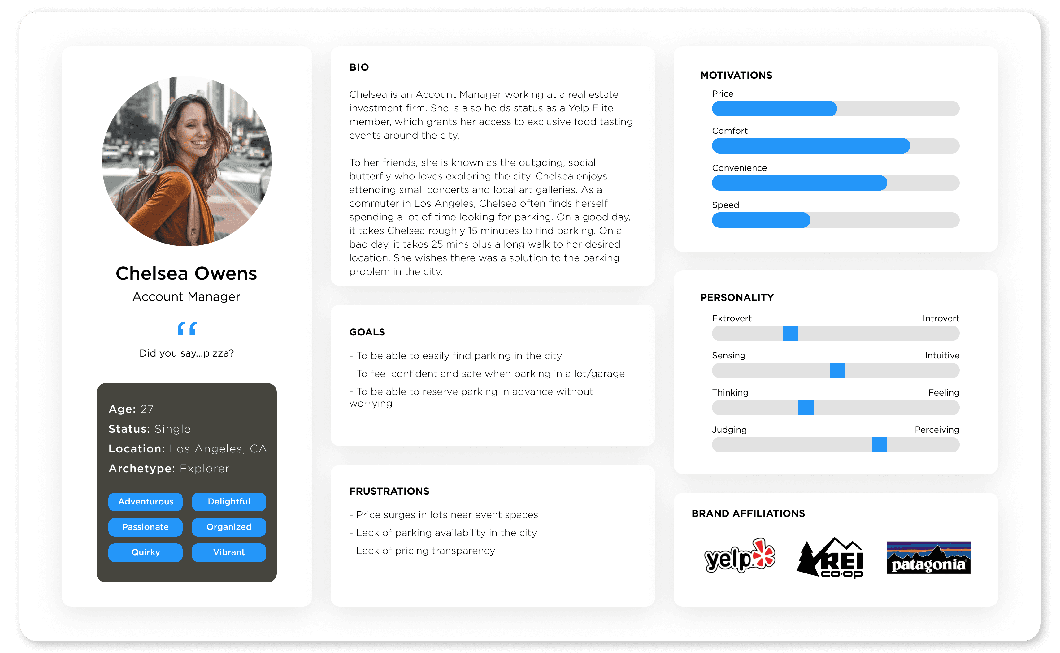
02

02

Define

Define

Define

PERSONA


With the data gathered in my research, I created a user persona to further define my audience and to help guide my design decisions moving forward.

Meet Chelsea Owens, an Account Manager based in Los Angeles, CA.

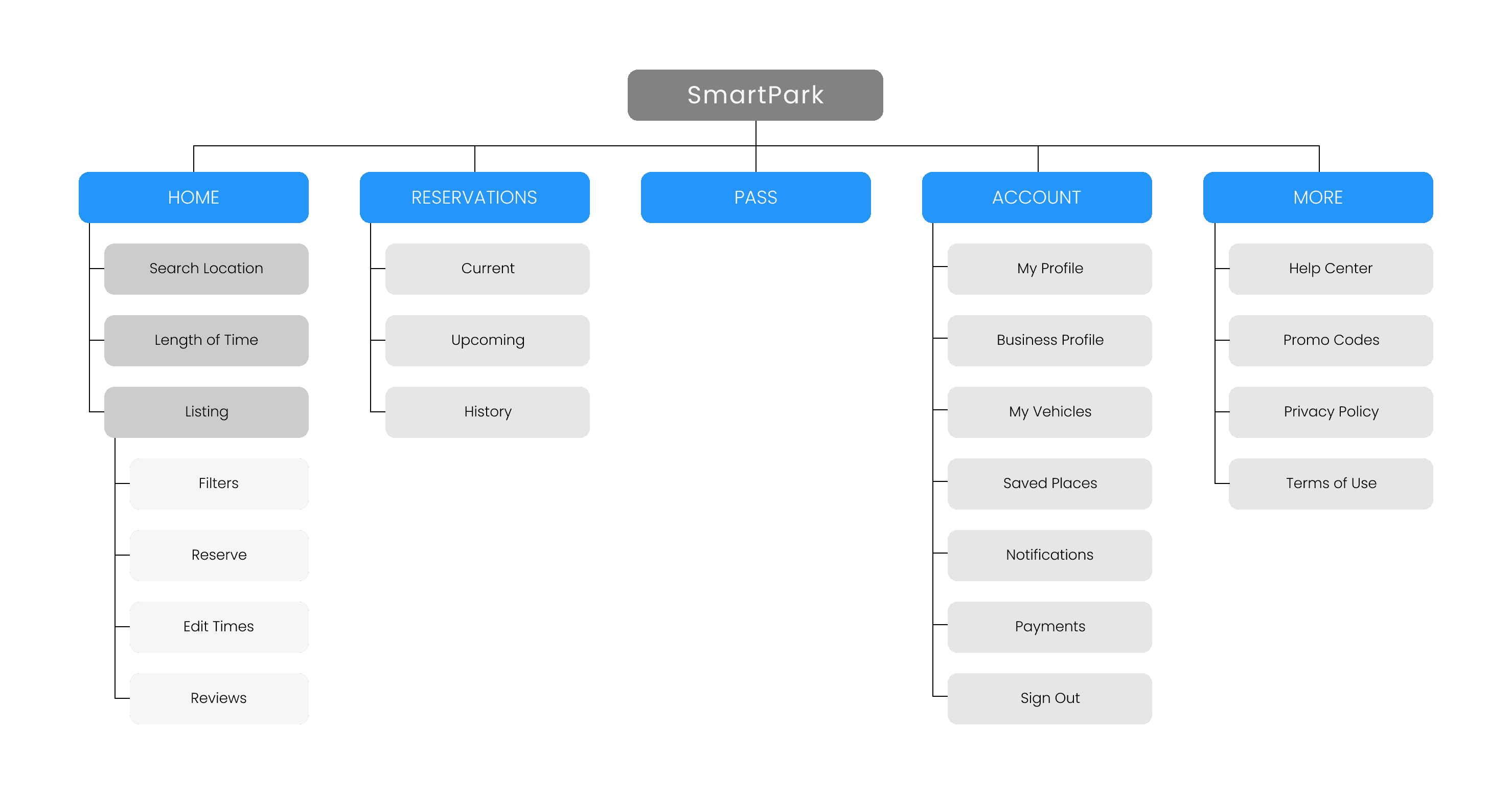
INFORMATION ARCHITECTURE


Next, I created a sitemap to help visualize the app’s information architecture. It details the app’s key pages, the hierarchy of information, and the relationship between one another. This will also be used to help guide my designs when it comes to building wireframes.

03

03

Ideate

WIREFRAMES & UI KIT


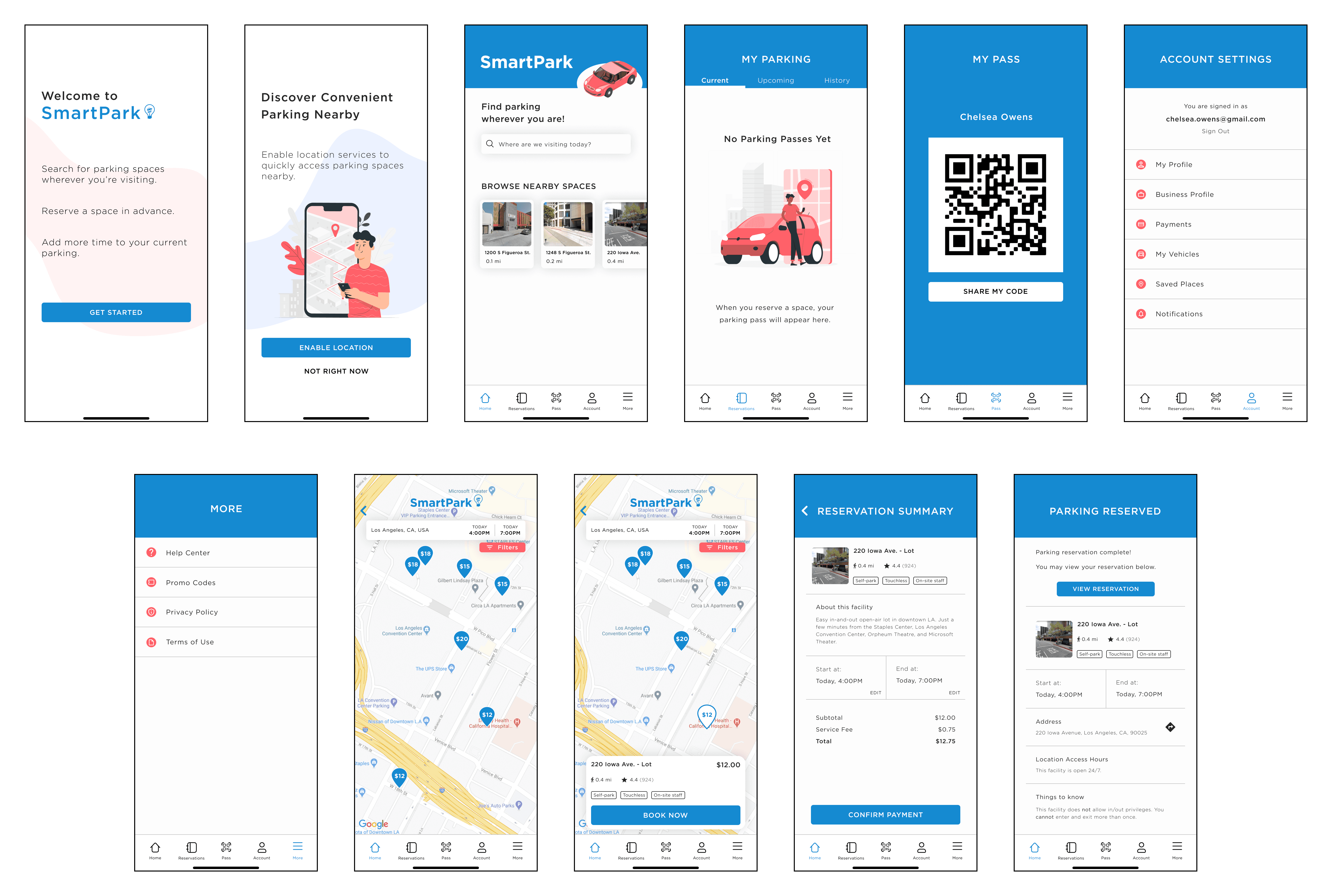
Keeping the users’ goals and pain points in mind, I created mid-fidelity wireframes to visualize the conversation between the users and the app. My main focus was to provide an MVP that captures a seamless and intuitive reservation process.

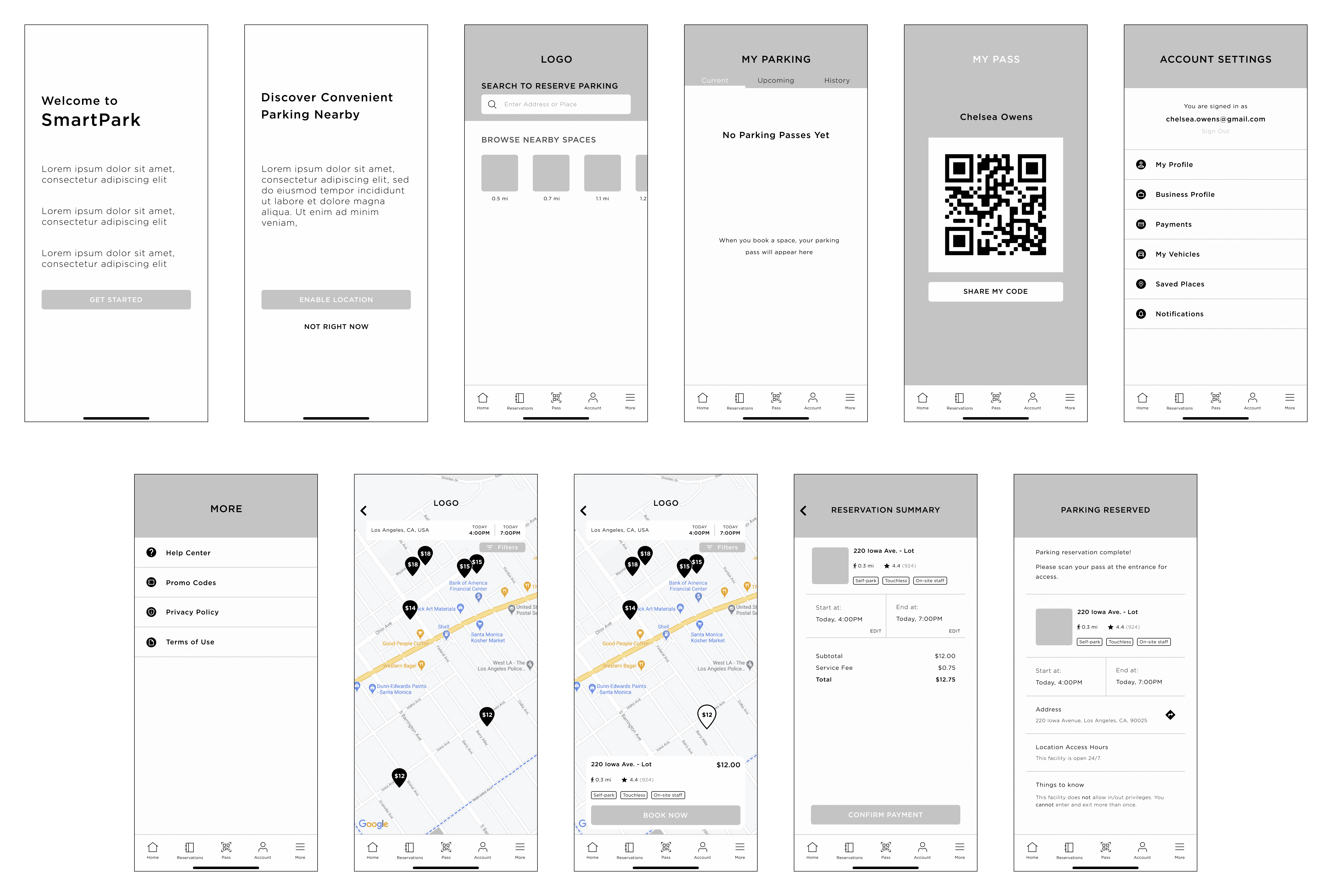
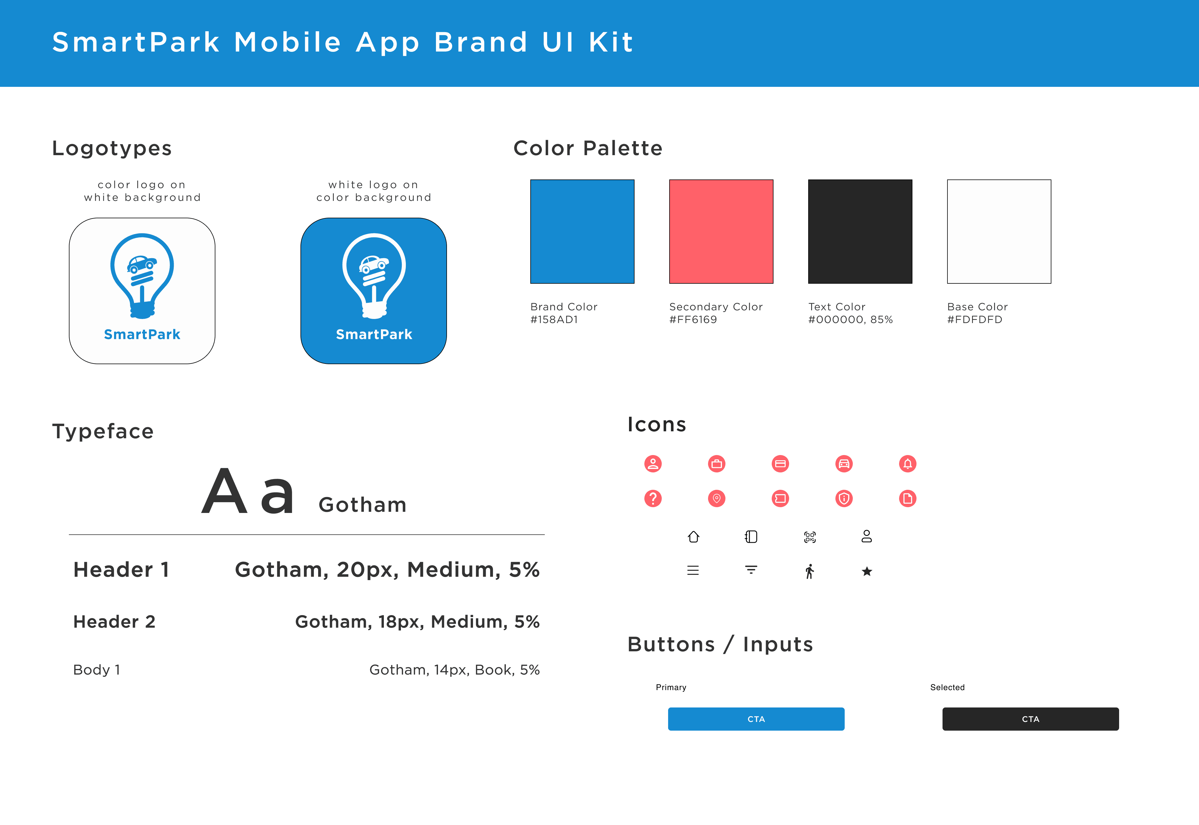
I also created a branding UI Kit that includes UI components that will be used throughout the app. This can also be referenced as a style guide and can be used to help maintain consistency on the app.

04

04

Prototype & Test

PROTOTYPING


To properly validate my design solutions, I created high-fidelity UI designs using my wireframes and UI kit. Interactions were created to mimic the app’s functionality, giving participants a more realistic feel for the app.

For the best experience, please view the prototype on desktop or use the link below:

USABILITY TESTING


To properly validate my design solutions, I conducted a usability test by recruiting a total of 3 participants, all falling under the target audience of being male or female drivers between the ages of 25-44. All participants were asked to take part in a remote-testing through Zoom.

The objectives of this test are to:

  • Test the overall navigation of the mobile app – Is the app clear and easy to use? Are the UI patterns consistent? 

  • Test if users are able to reserve a parking space

  • Observe browsing and usability patterns

  • Discover any pain points and/or gains of the users


Task - Reserve a parking space near your conference, which is hosted at the Los Angeles Convention Center. You are looking to reserve a spot from 4:00pm - 7:00pm on February 18, 2021.


Task completion rate – 100%
Error-Free Rate: 93%

What others are saying:

What others are saying:

“The app was very straightforward and clear. This is definitely a game-changer for parking in the city.”

“The app was very straightforward and clear. This is definitely a game-changer for parking in the city.”

Brian Ngo, 30 years old

Brian Ngo
30 years old

“I love this idea! I live and work in the city so this will definitely make my life easier.”

“I love this idea! I live and work in the city so this will definitely make my life easier.”


“I love this idea! I live and work in the city so this will definitely make my life easier.”

Annie Zhao, 25 years old

Annie Zhao

25 years old

"The app was very intuitive. It reminds me a lot of Yelp. It’s easy to use."

"The app was very intuitive. It reminds me a lot of Yelp. It’s easy to use."


"The app was very intuitive. It reminds me a lot of Yelp. It’s easy to use."

Gershwin Merencillo, 26 years old

Gershwin Merencillo

26 years old

OPPORTUNITIES


With the usability testing complete, there were several areas of opportunities mentioned by users that could improve the overall experience on the app. Here are the key opportunities that can be addressed in the first round of revisions:


  • Home tab minimal redesign; users mentioned that it didn’t quite flow with the other pages and could be visually improved

  • Include a clearer description of the next steps after reserving a parking space; users felt a bit lost on what to do after they reserved a spot

  • Add more parking locations so users are able to fully experience the options provided on the app

05

05

Conclusion

Conclusion

Conclusion

Being that this is my first project designing an end-to-end mobile app, I felt that I was met with decent success. I was able to utilize my personal experience living and working in a metropolitan city to empathize with users' frustrations. Having this experience helped provide more educated assumptions to guide my research and design. In addition, I was also able to learn more about Apple’s Human Interface Guideline for iOS and study design patterns that meet high expectations for quality and functionality.

One thing that I did struggle with is finding more participants for user interviews and usability testing. With more participants, I would have been able to gather more insights to guide design decisions and more data to validate my design solutions.

Got a project in mind?

Got a project in mind?

Got a project in mind?